Product Overview Redesign
Iterative design research to fix critically low engagement on IBM Product Overview pages, where most visitors never scrolled past the hero.
- Client
- IBM
- Role
- UI/UX Designer
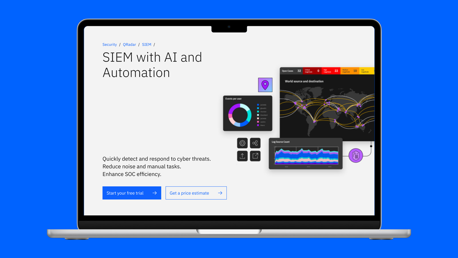
In Q2 2024 we noticed critically low engagement and shallow scroll depth on IBM's Product Overview pages — average time spent below the hero was under 4 seconds. Qualitative research pointed to the cause: visitors felt overwhelmed by dense text immediately below the hero, bounced quickly, and fell back on navigation menus instead of reading on.
Approach
Three user studies across seven design iterations with 71 participants isolated the pain points and tested hypotheses. The fix wasn't new content — the core copy stayed the same — it was progressive disclosure and microinteractions that hid detail until a visitor actively asked for it, cutting the cognitive load of the page without cutting what it said.
Results
The final experiment measured a clear lift across every key metric.
+61%
Use case engagement
+31%
Features engagement
+24%
Information recall
+15%
Confidence in product knowledge
The patterns
Five recurring components carried the four recommendations that came out of the research.
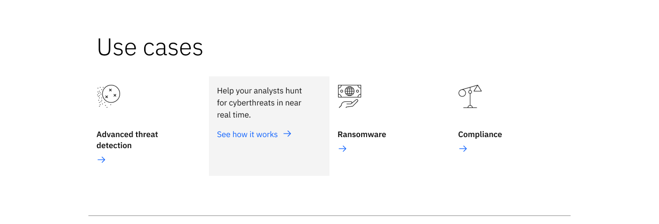
Use cases
Prioritize user intent: use cases moved higher on the page, with a hover state that reveals detail only once a visitor shows interest.
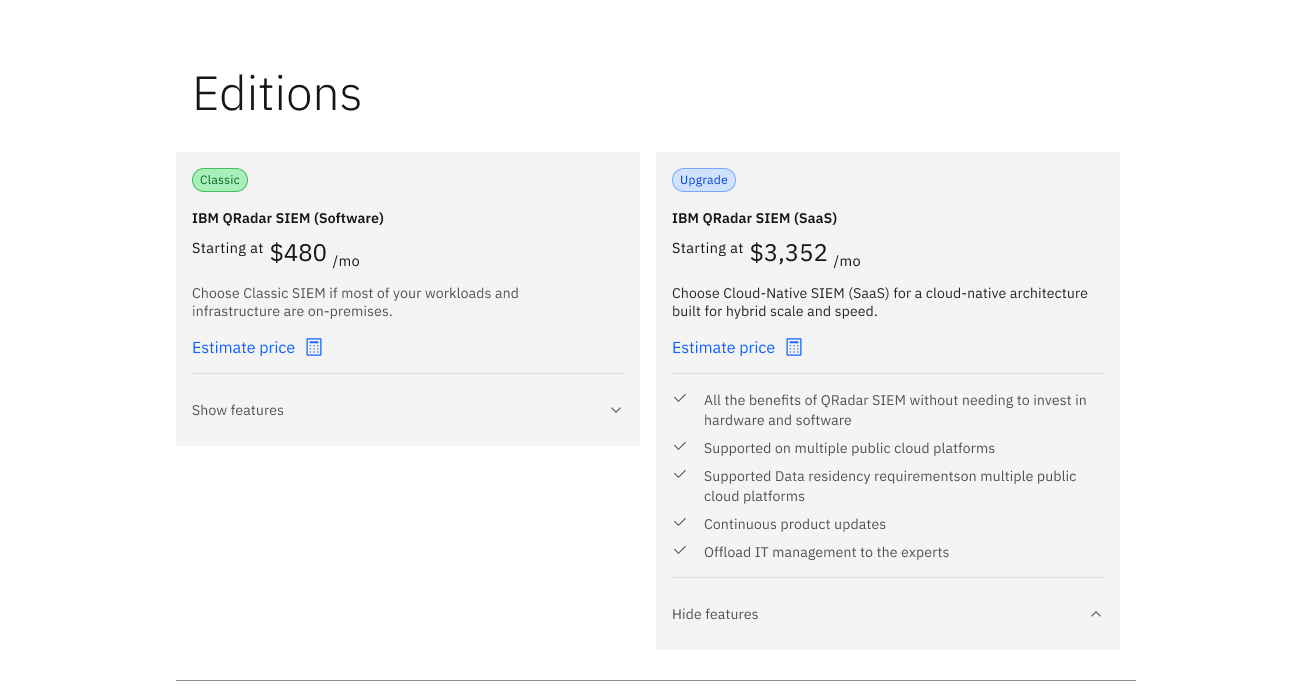
Editions
Transparency in pricing: cost surfaced immediately, with a Show features toggle keeping the page scannable without hiding the number itself.

Client stories
Visual proof: real customer outcomes carried by photography and a headline stat, instead of another paragraph of claims.
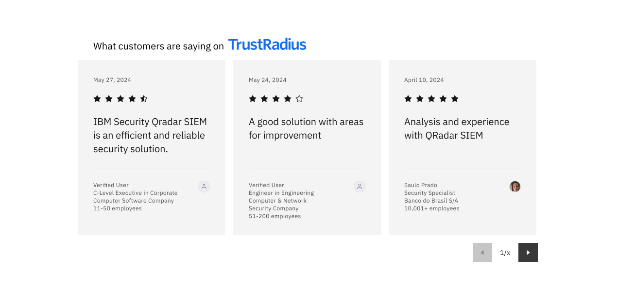
Third-party reviews
Visual proof: independent TrustRadius reviews add credibility that on-page copy alone can't.
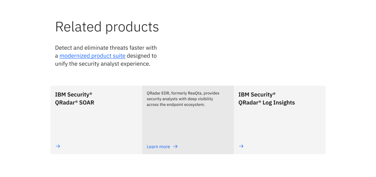
Related products
Succinct communication: a lightweight, text-only card for lower-priority cross-sell content that doesn't compete for attention.
A detailed research deck — including the full study methodology and iteration history — is available on request.