Clear Path to Convert
Utilizing iterative research to diagnose low conversion among a specific segment of customers.
- Client
- IBM
- Role
- UI/UX Designer
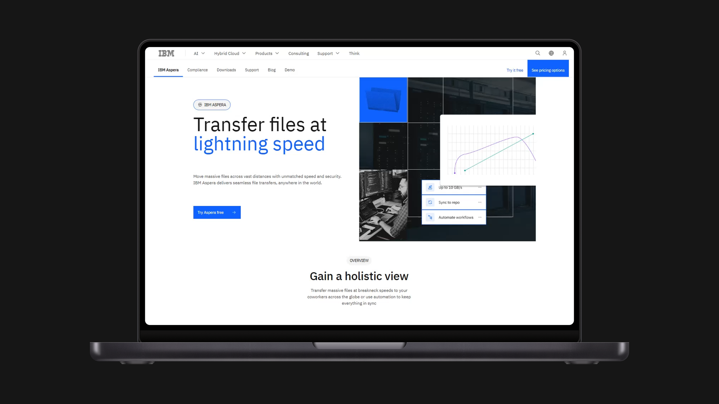
Working within a specific, underperforming customer segment on IBM.com, I ran iterative rounds of research to diagnose where and why visitors were dropping off before converting. What started as a single-page fix became a standardized, research-backed framework — a repeatable anatomy for high-converting pages — now used to guide page design across the IBM.com ecosystem.
The framework
Six recurring building blocks, each solving a specific reason visitors stall before converting.
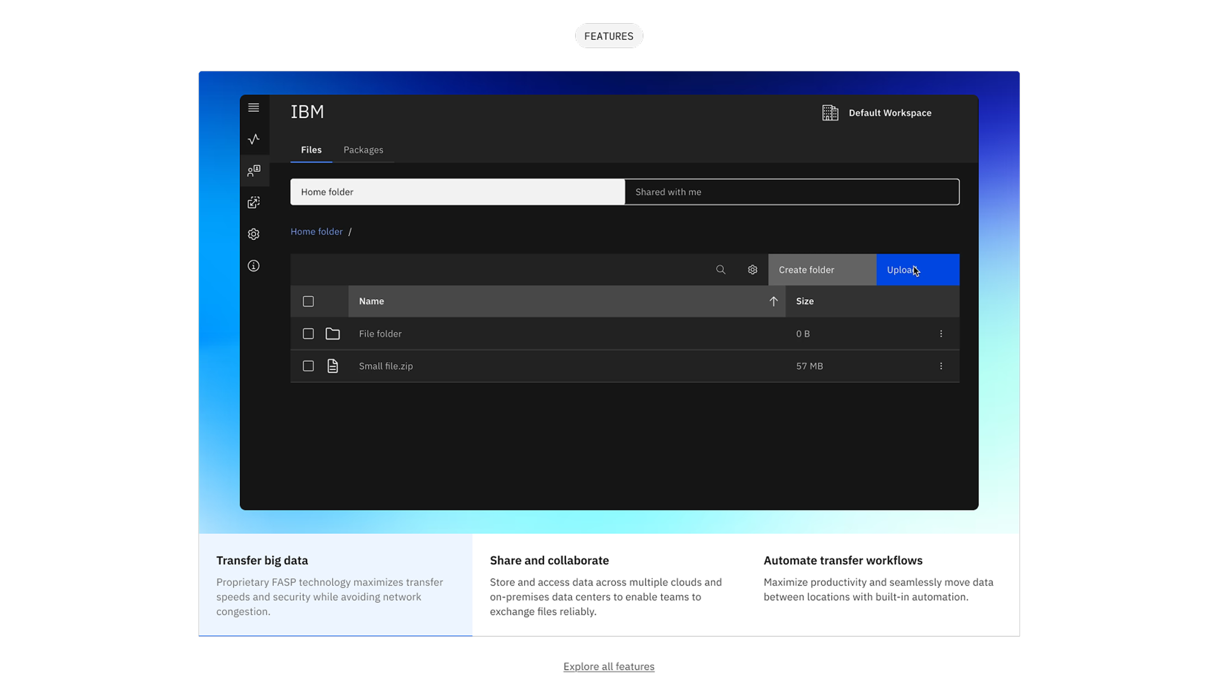
Features
A features grid pairs the product UI with plain-language benefit statements, so visitors don't have to infer what the product does from a screenshot alone.
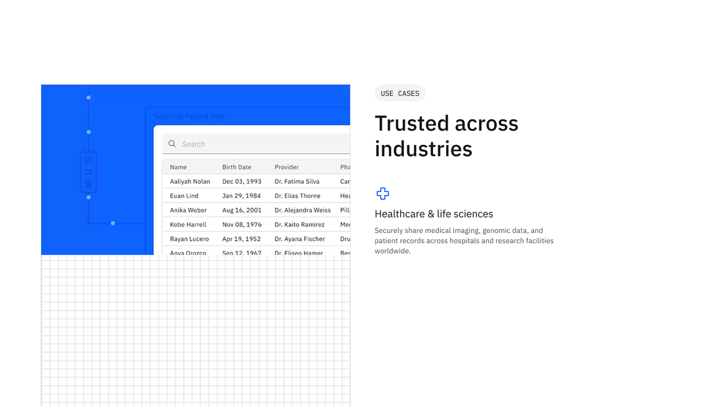
Use cases
Industry-specific use cases — healthcare, finance, media — let different buyer personas recognize their own workflow in seconds.
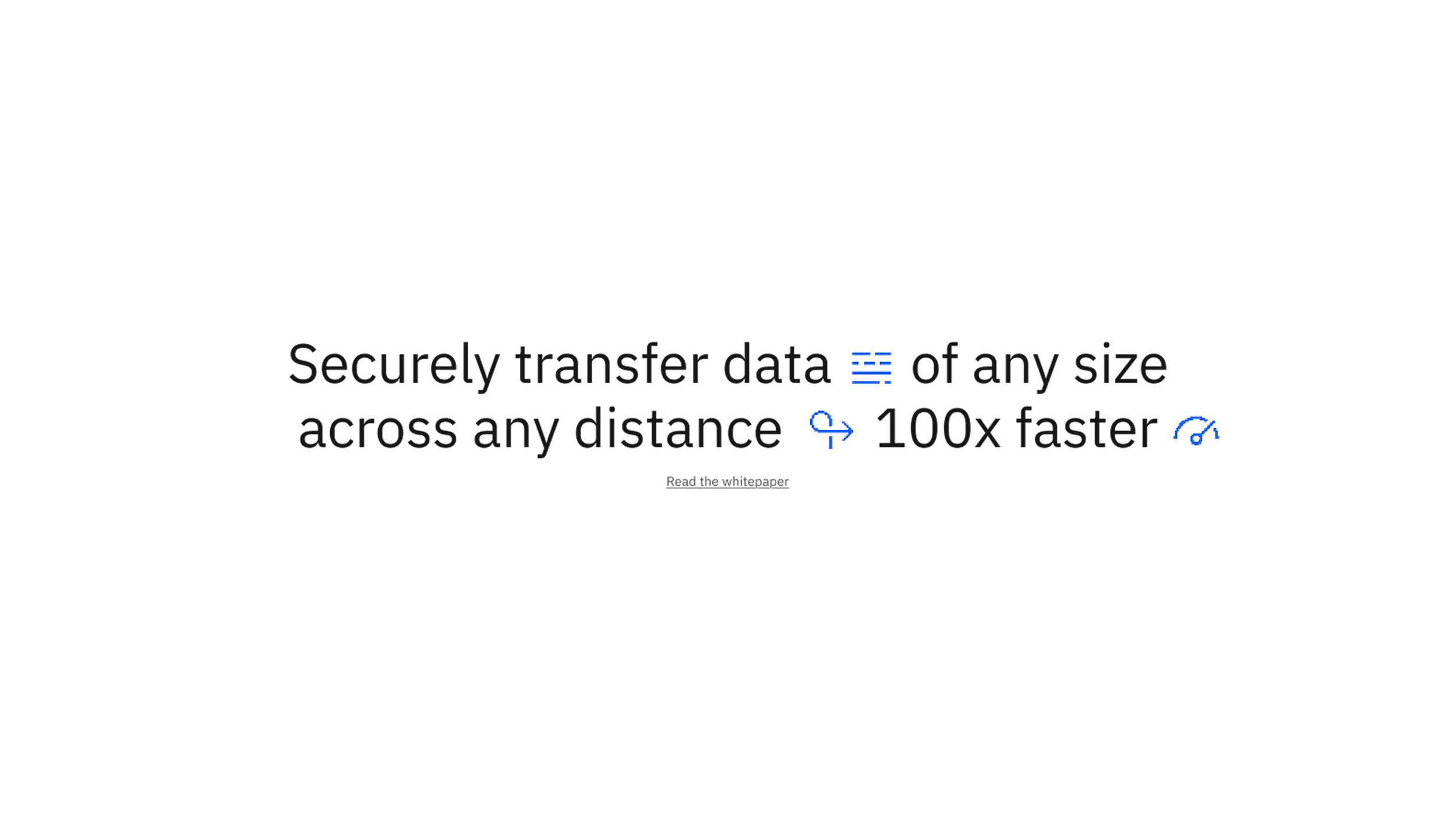
Interstitial
A mid-scroll callout restates the value proposition in concrete, numeric terms for visitors who are skimming rather than reading.
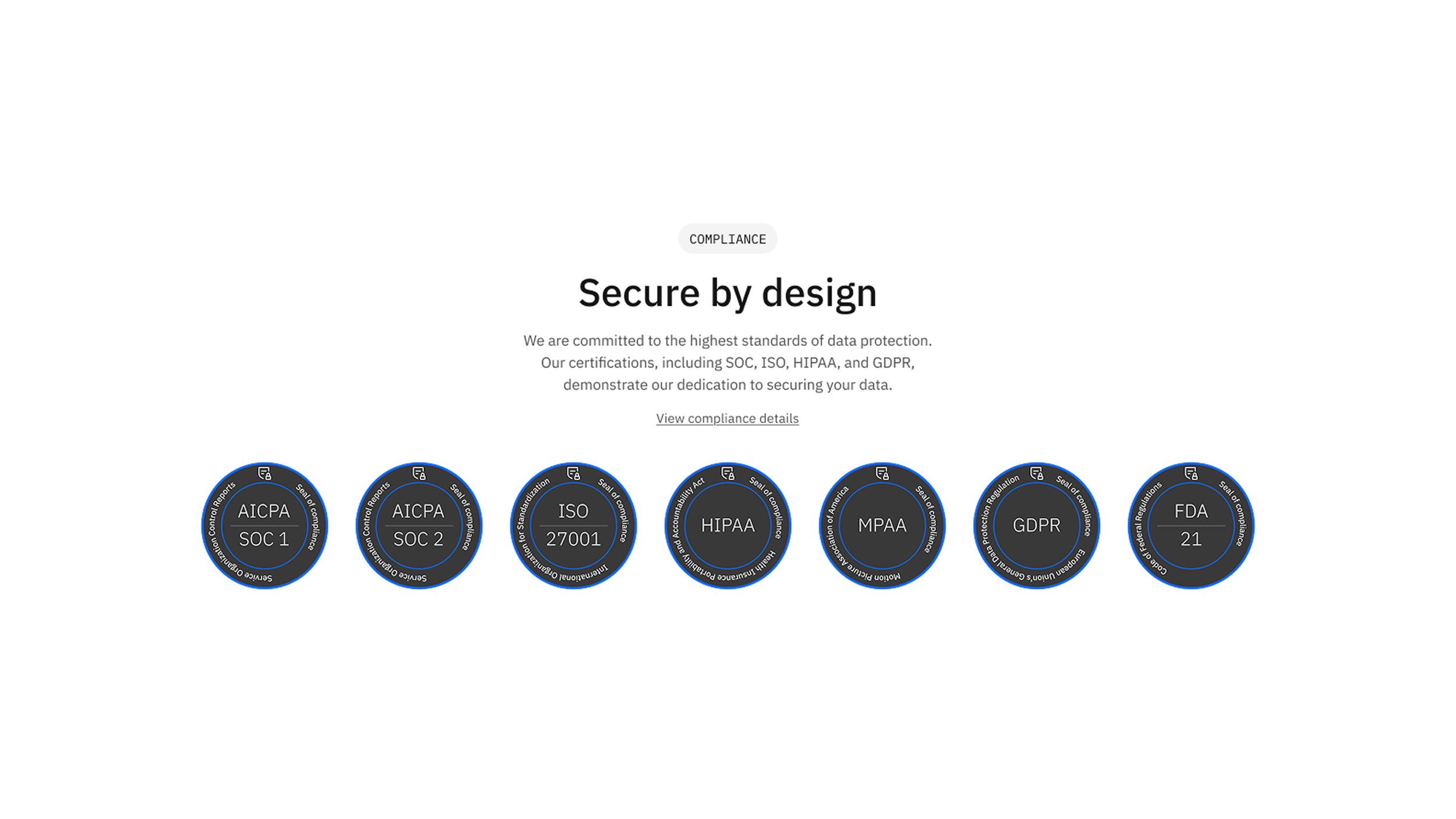
Compliance
Compliance badges surface security and regulatory credentials exactly where risk-averse, enterprise buyers look for them.
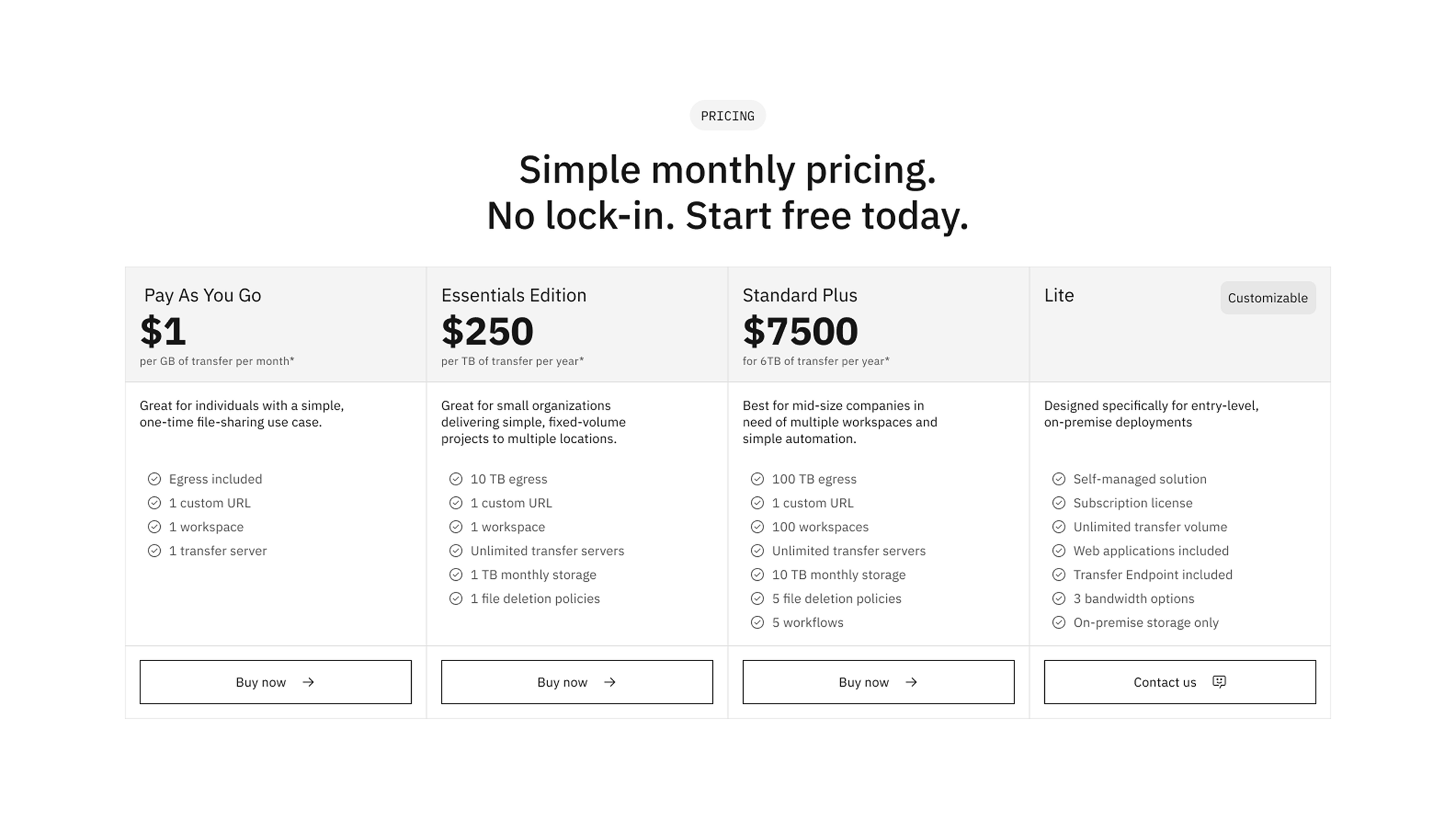
Pricing
Transparent, tiered pricing with clear feature deltas removes the single biggest point of hesitation before checkout.
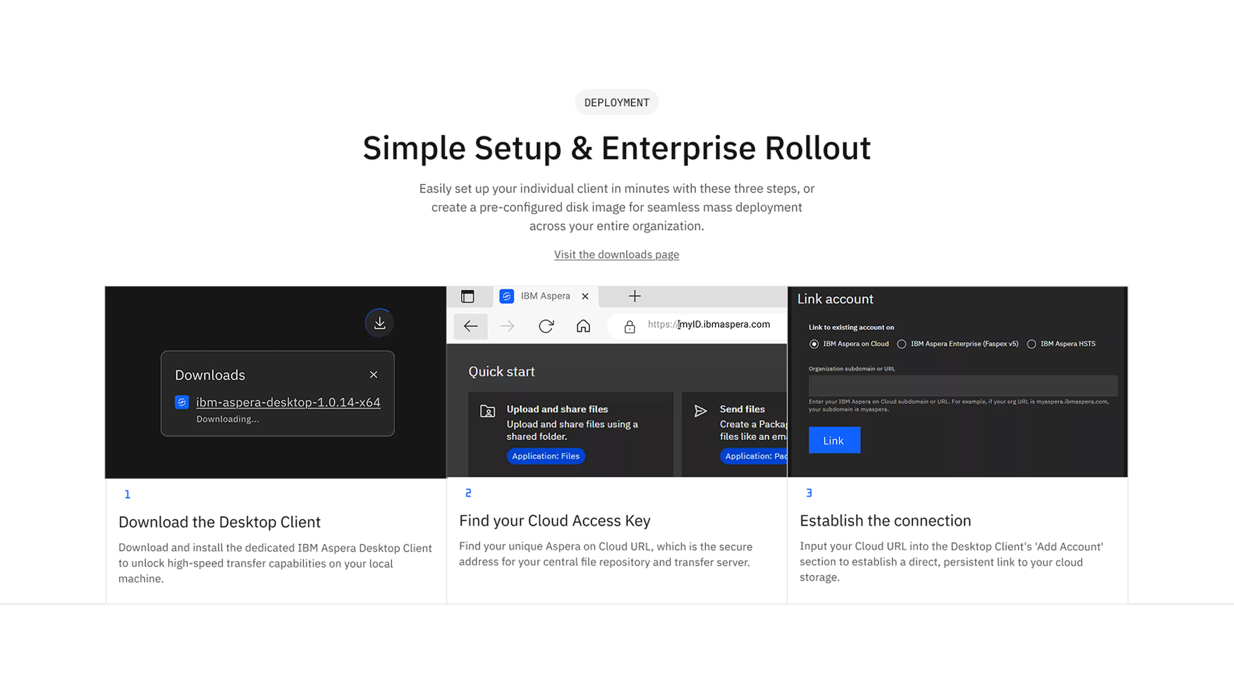
Deployment
A numbered, three-step setup walkthrough turns 'how do I even start' into a concrete, low-friction task.
Applied across products
The same framework carried over to IBM Concert, adapted for a mobile-first audience — proof the approach held up beyond a single product team.
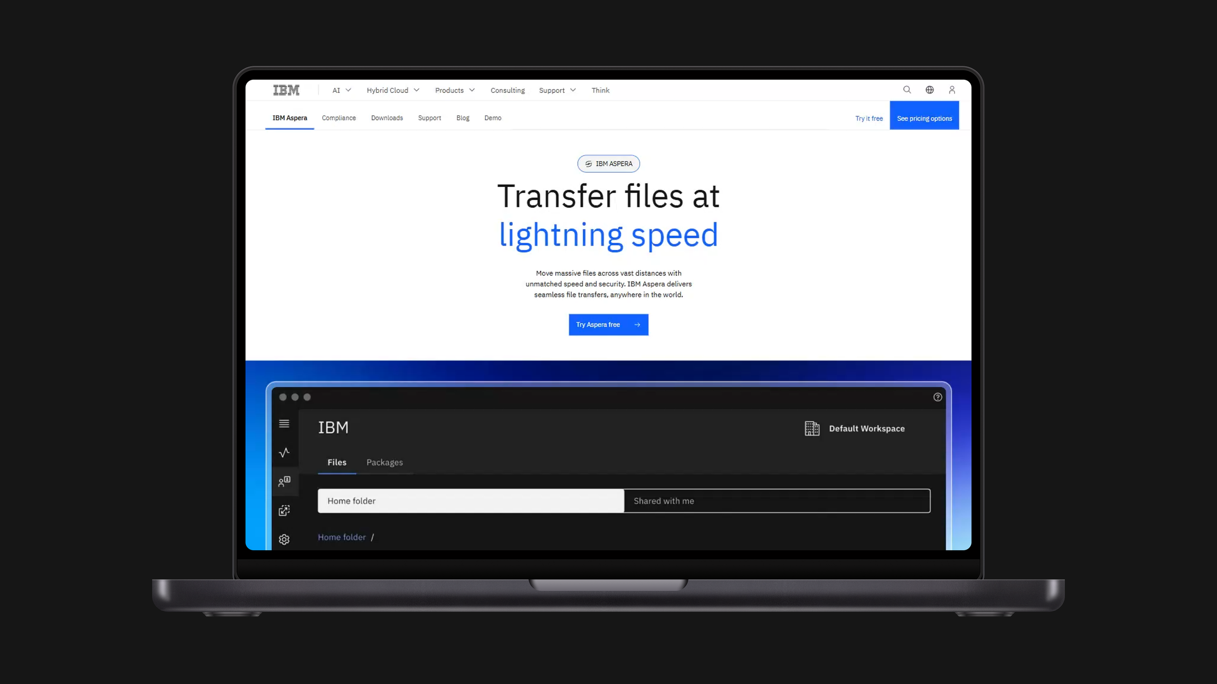
IBM Aspera — desktop
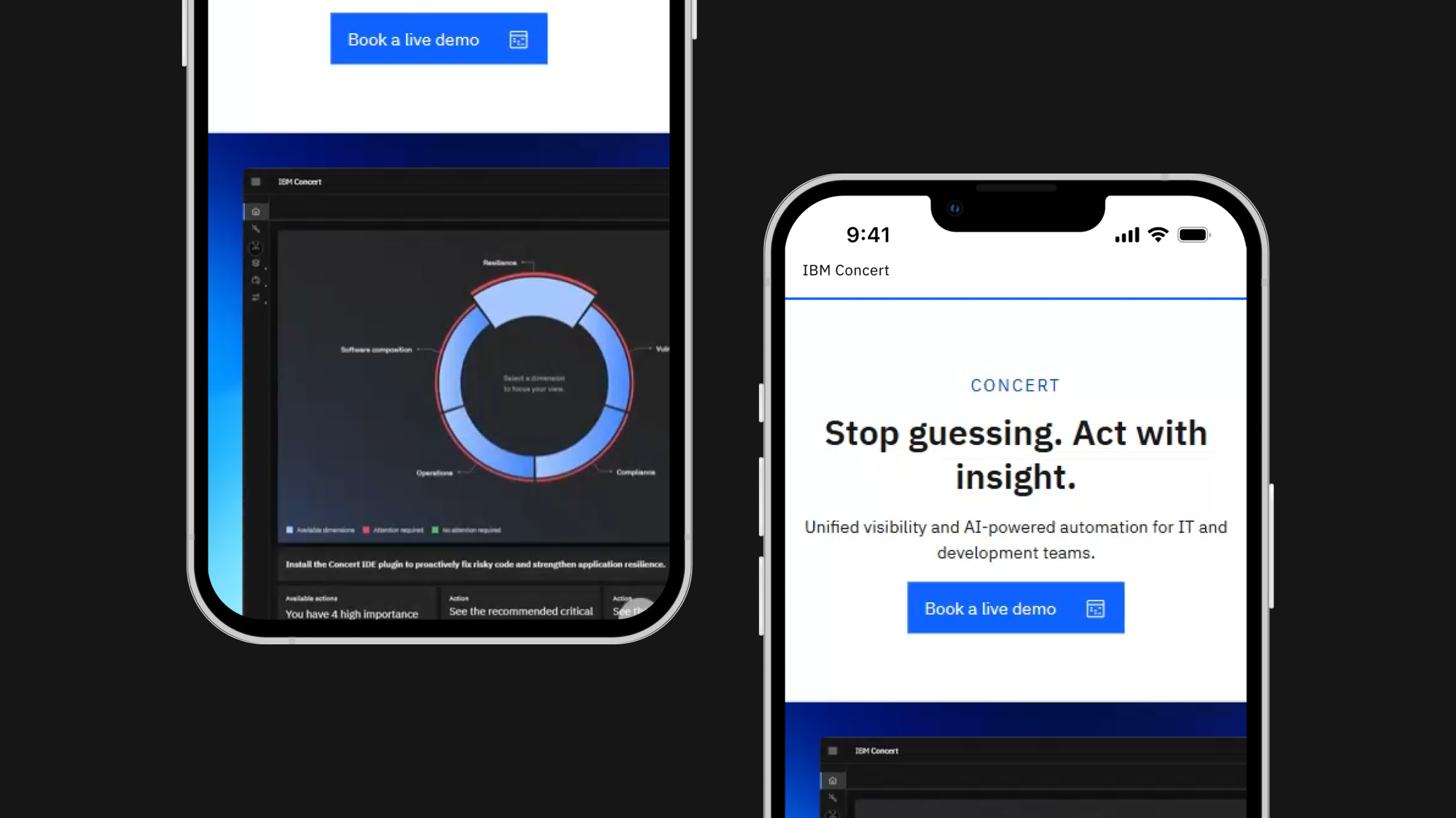
IBM Concert — mobile
A detailed research deck — including the original conversion audit and testing methodology — is available on request.