Mobile Optimization
Delivered final designs and specs to enhance the mobile experience of IBM.com, with direct development support for a fast, successful release.
- Client
- IBM
- Role
- UI/UX Designer
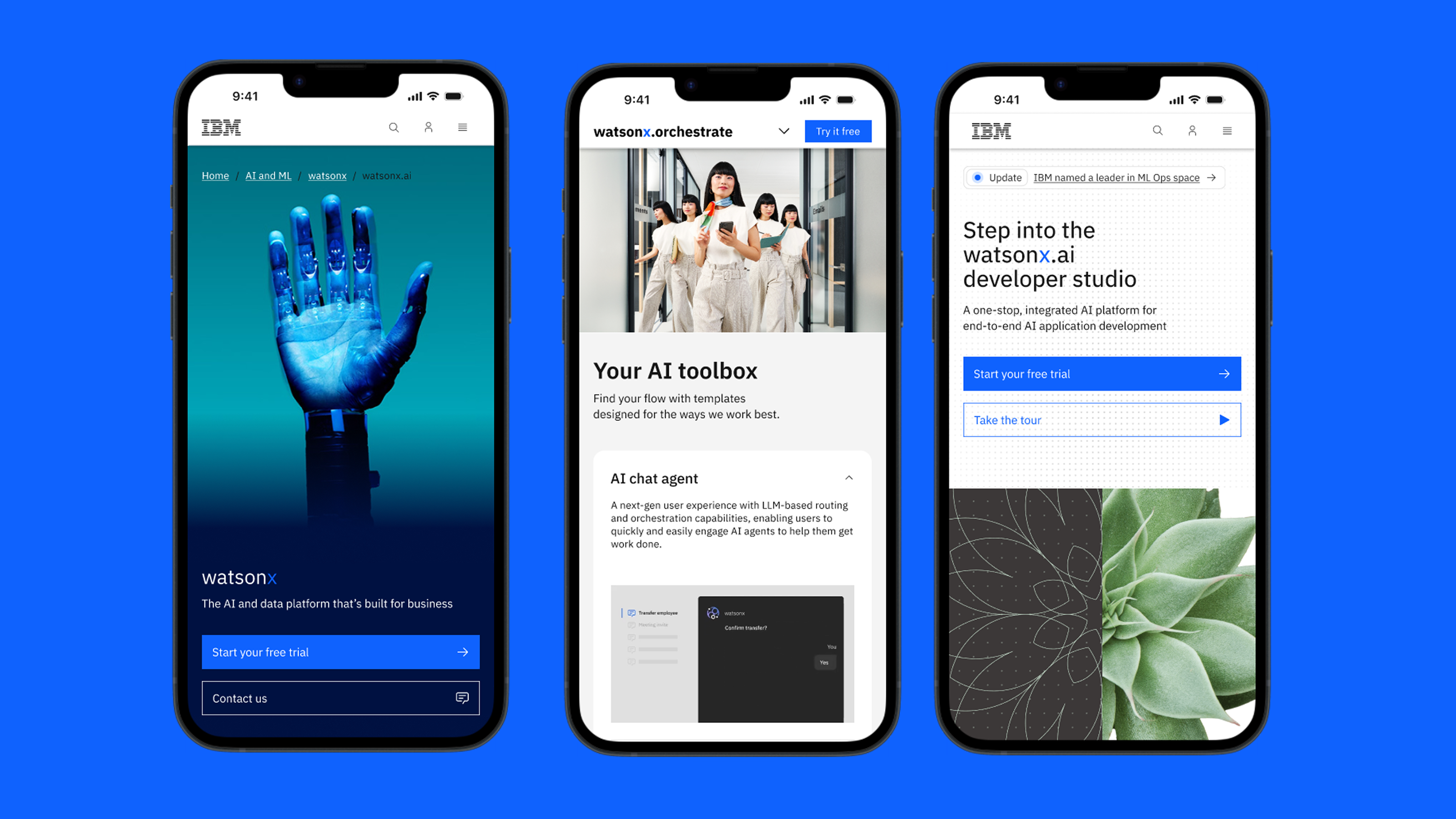
IBM.com serves a huge range of products and campaigns, all needing the same core building blocks — heroes, feature cards, carousels, accordions — to hold up cleanly at phone width. I delivered final mobile design specs for these components and worked directly with development to ship them fast, without slowing down the teams building on top of them.
The component library
Seven recurring patterns, specified once and reused across the site instead of redesigned page by page.

Leadspace
A configurable hero — eyebrow, breadcrumb, heading, and dual CTAs — sized to stay legible on a phone without pushing a page's actual content below the fold.

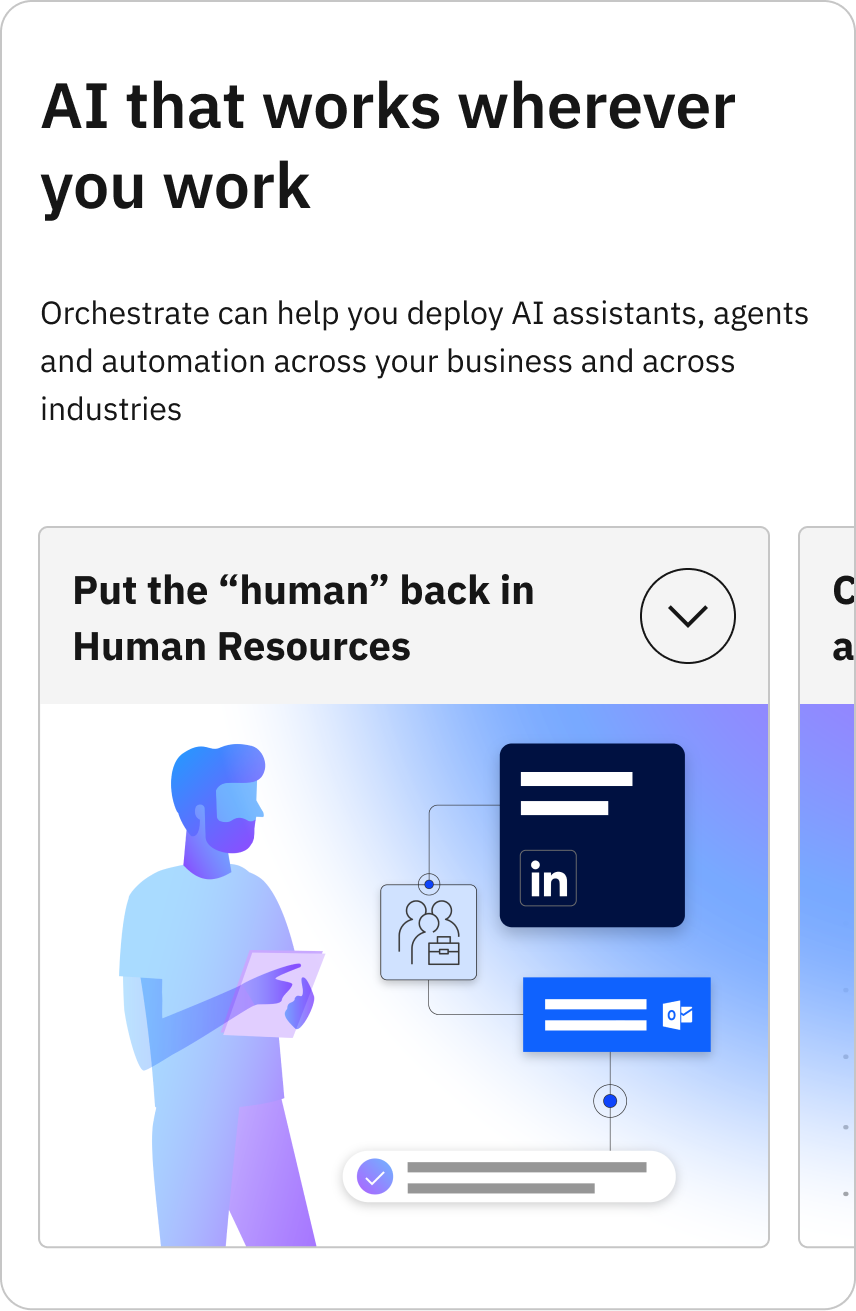
Carousels
Horizontal-scroll cards keep dense, multi-item sections — features, use cases — usable on a phone instead of an endless vertical stack.
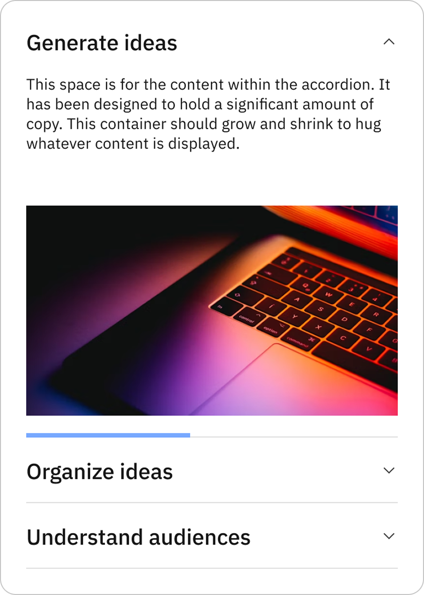
Accordion
Collapsible sections keep long-form content scannable, expanding only what a visitor actually wants to read.
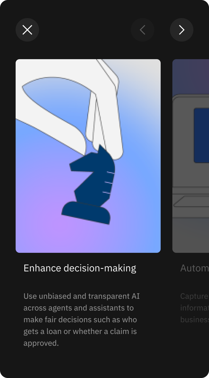
Drawer
A full-screen modal carousel lets visitors dive into one card's detail without losing their place in the page behind it.
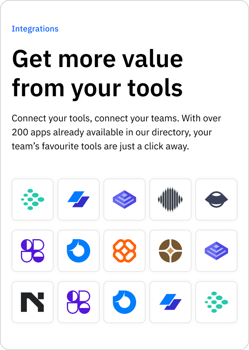
Integrations
A compact logo grid that scales from a handful of partners to hundreds without needing its own dedicated page.

Pictogram list
A vertical, icon-led list turns a dense features section into a fast, single-column scan.

Video player
An inline player keeps supporting media — podcasts, product demos — native to the page instead of linking out.
One template, many contexts
The feature card shipped as a literal spec — eyebrow, fluid heading, body copy — so any team could drop in their own imagery and copy without touching the layout.
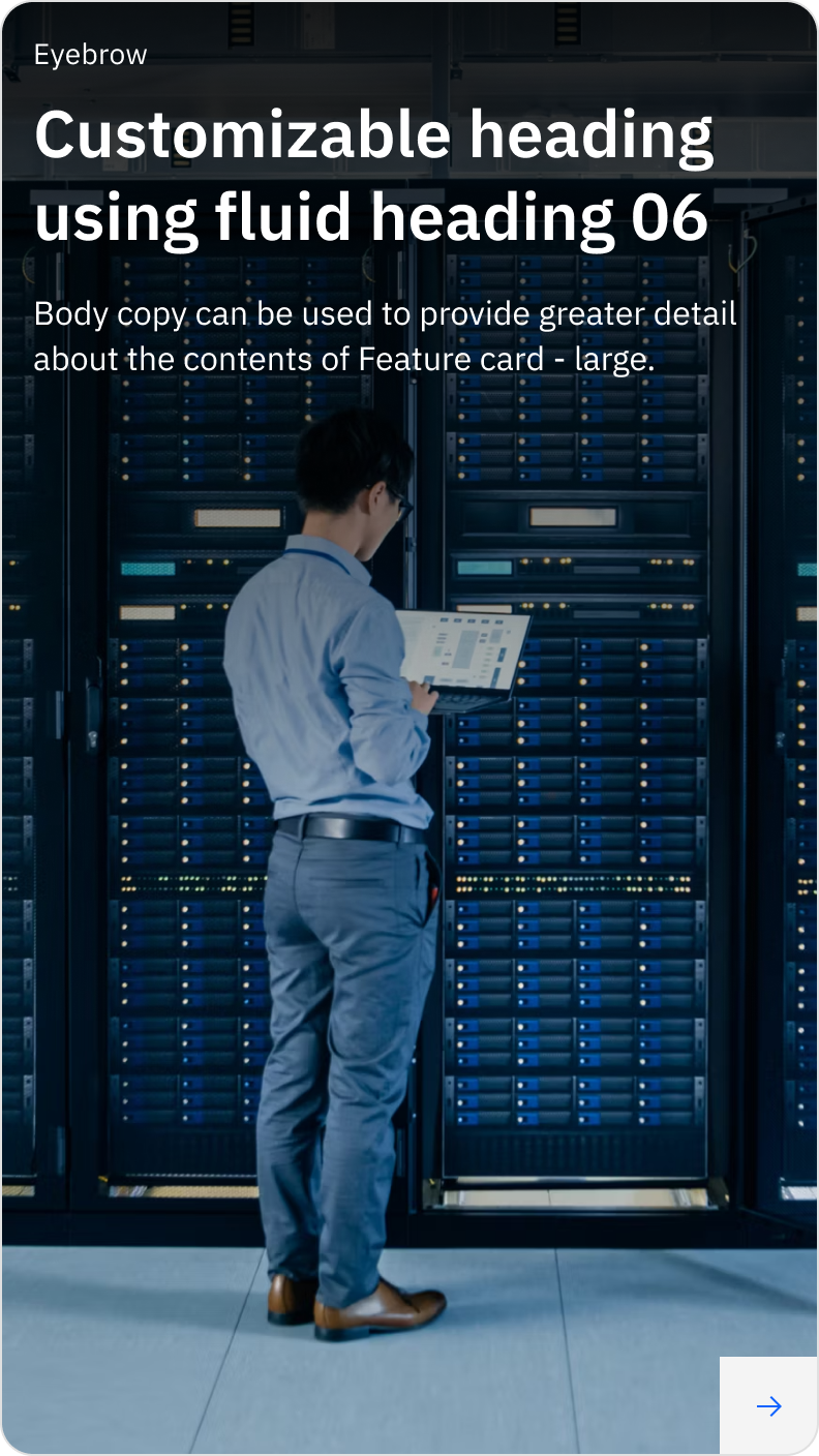
Feature card — photography-led
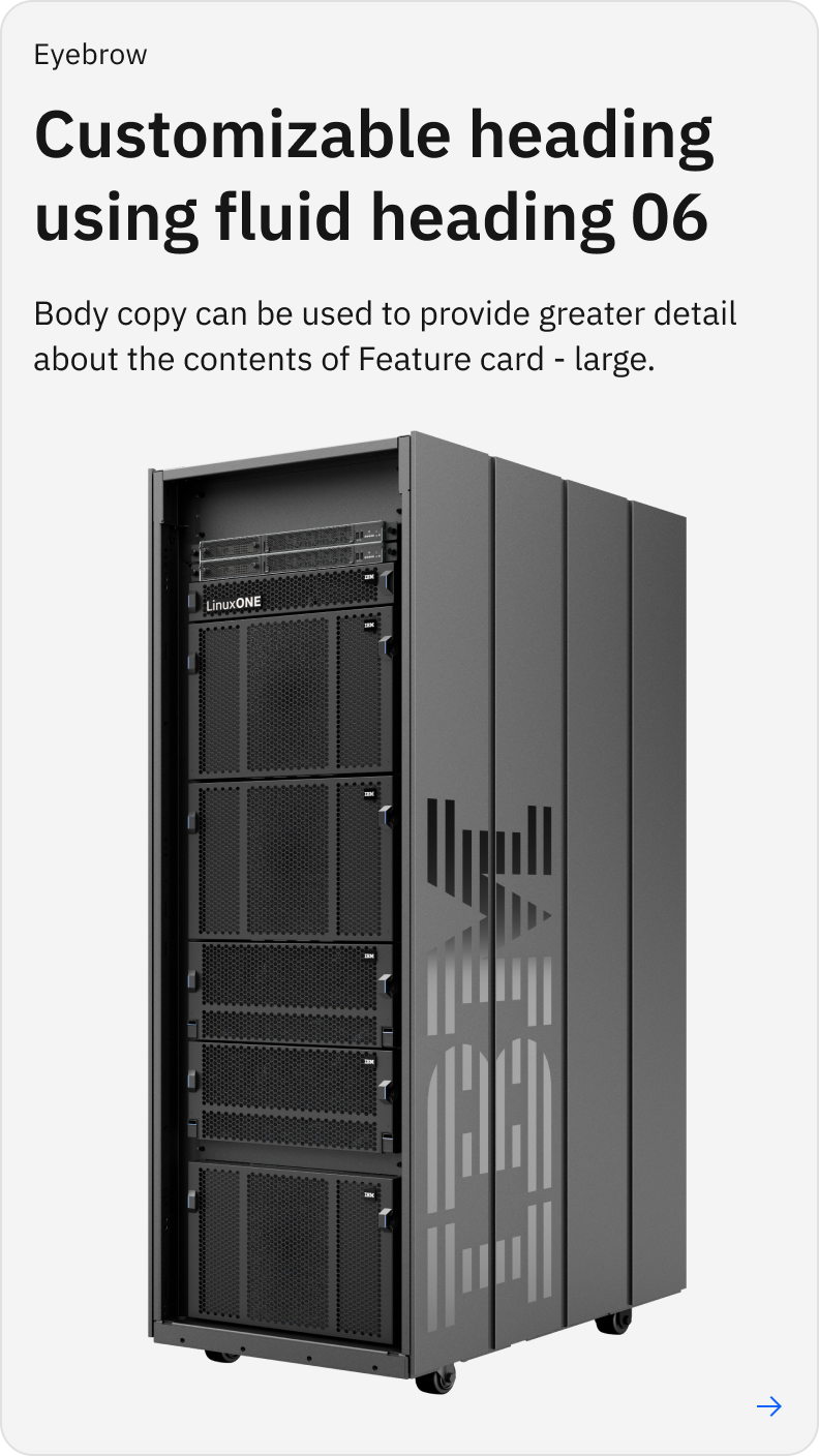
Feature card — product-led
Full mobile specs — including responsive breakpoints and interaction states — are available on request.